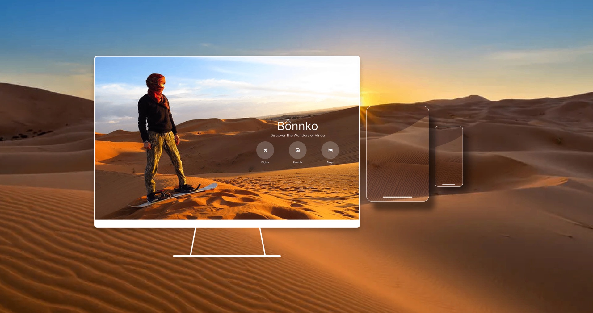
People wanted one reliable place.
Interviews with middle-class travelers aged roughly 25 to 70 kept pointing to the same frustration: information scattered everywhere. The key insight was clear: they wanted a one-stop shop for all their travel needs that they could rely on.
12were frustrated by scattered information
11wanted bundles or vacation packages
4still drove to an agency to book
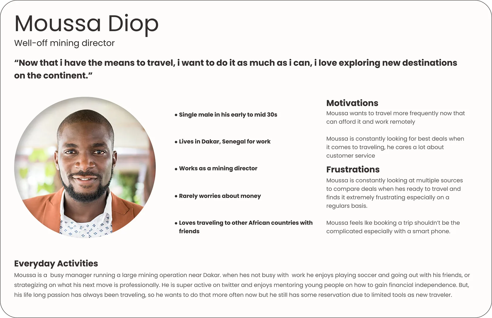
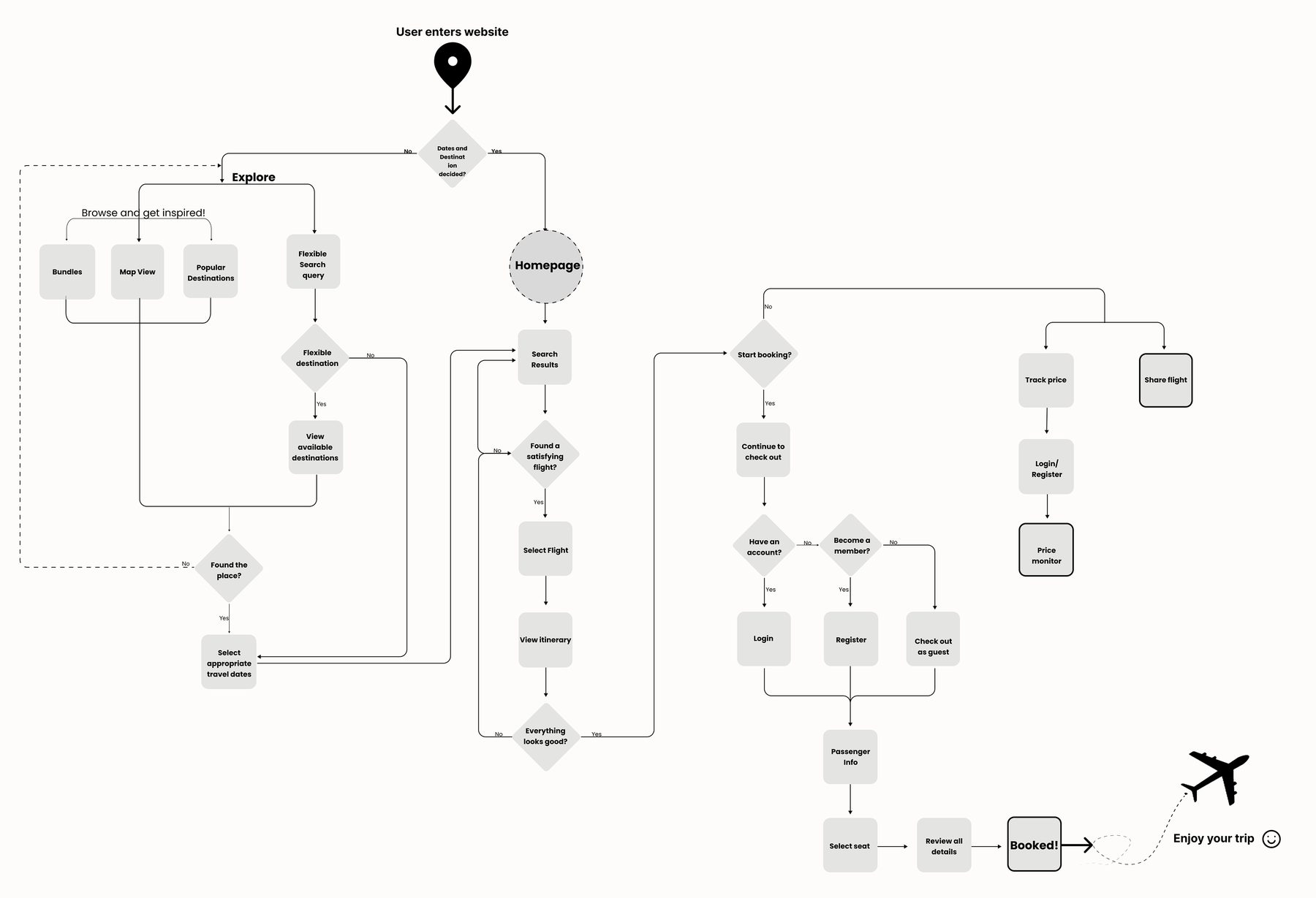
Testing changed the structure early.
- A competitive review of Expedia, Airbnb and TripAdvisor
- User flows and site maps, then three low-fi home page versions
- Testing showed a separate landing page added nothing, so it was cut
- Built a design system before high fidelity, so screens stayed consistent
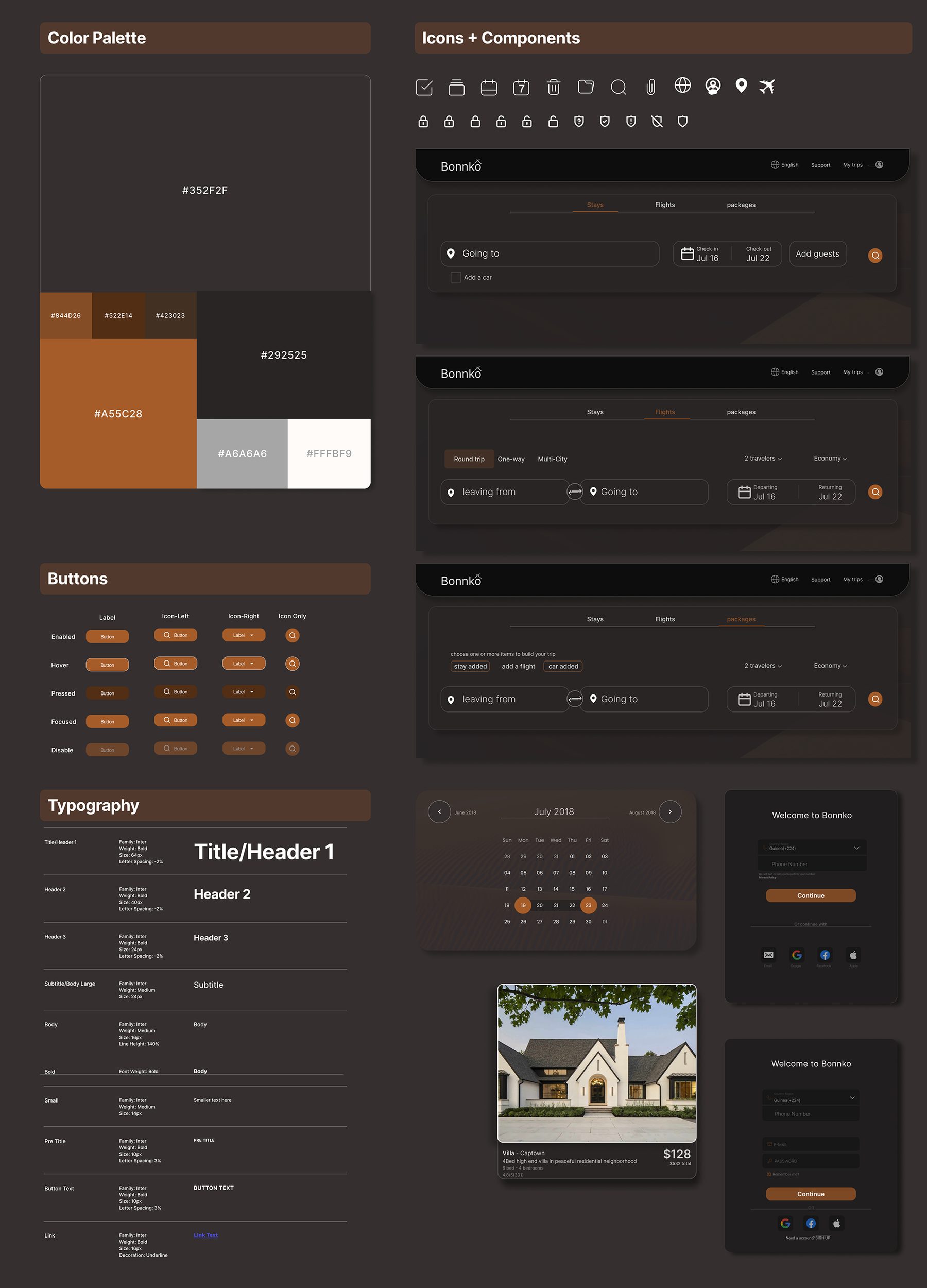
Less clutter, faster booking.
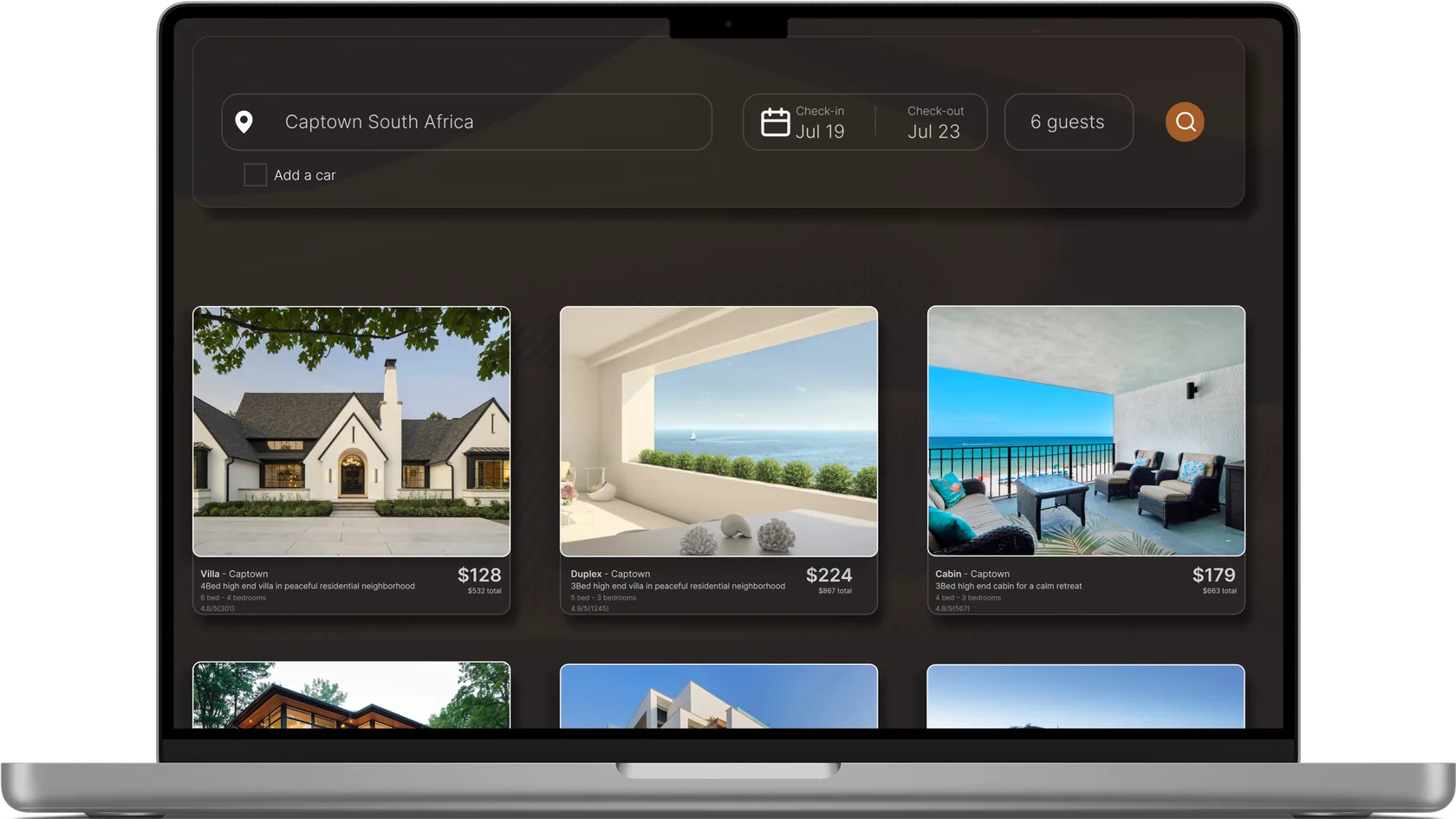
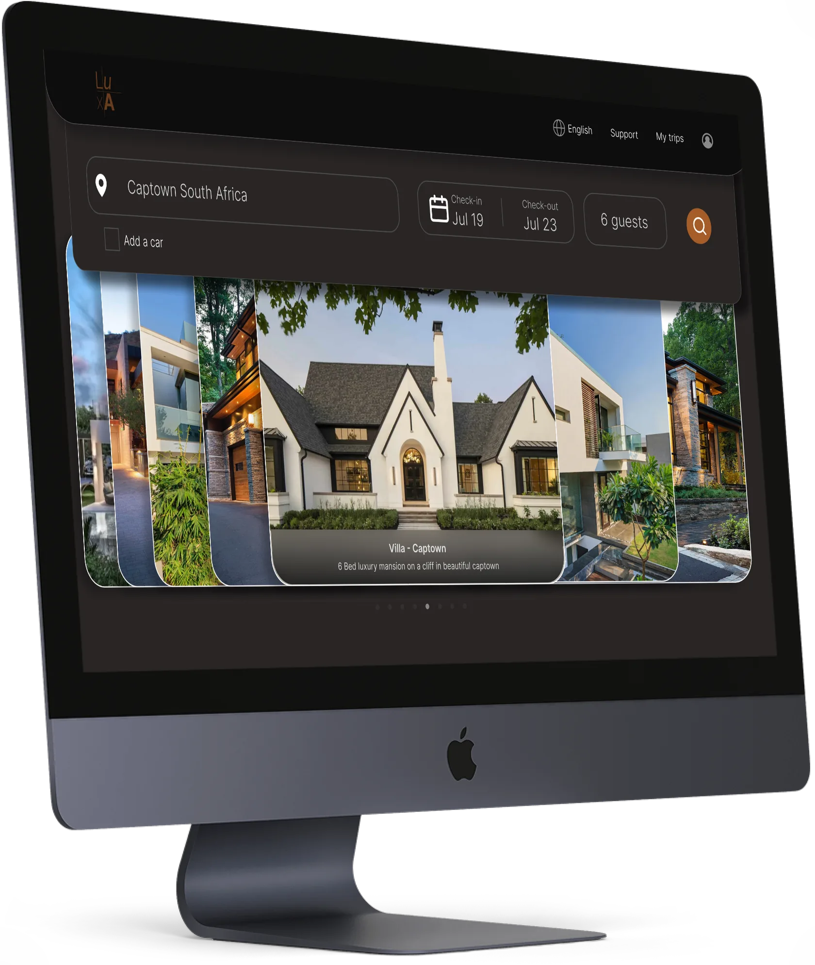
- A search bar that follows you across the site, ready when an idea strikes
- Bundles and packages for hassle-free booking
- Trending destinations and latest deals on the home page
- Filters and a simpler layout to cut confusion
Usability testing.
100%booked a flight with the search bar
100%said bundles made them more likely to book
75%navigated the site with clarity
Four participants tested the high-fidelity prototype.
Advocate for research earlier, before high fidelity.