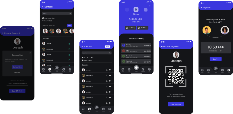
Nine people, two countries, four user groups.
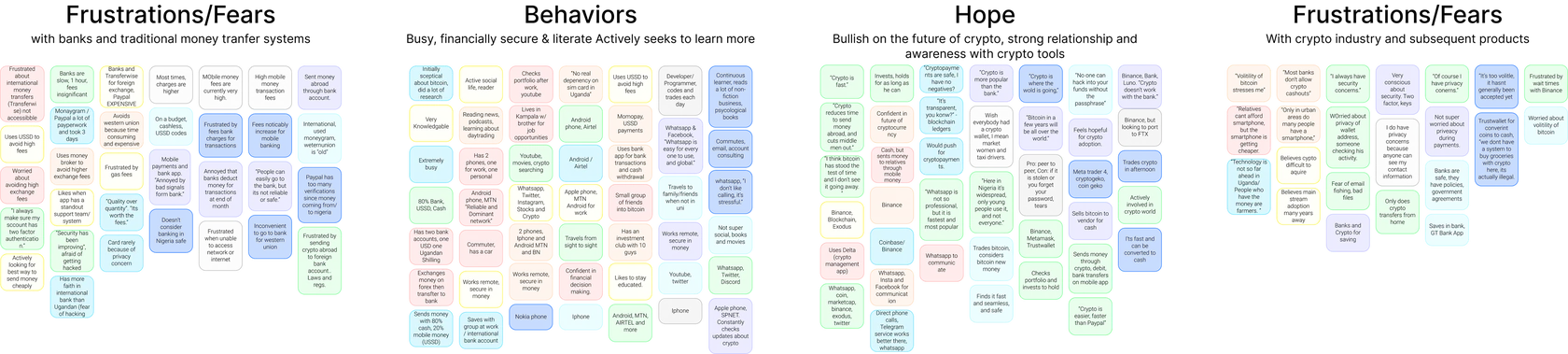
Surveys measured how people relate to mobile money and blockchain. I then interviewed 9 adults aged 25 to 70 across two countries to reduce bias, and grouped the insights with affinity mapping into four user groups and a persona. A competitive review of Western Union, Flutterwave and WorldRemit confirmed we were solving the right problem.
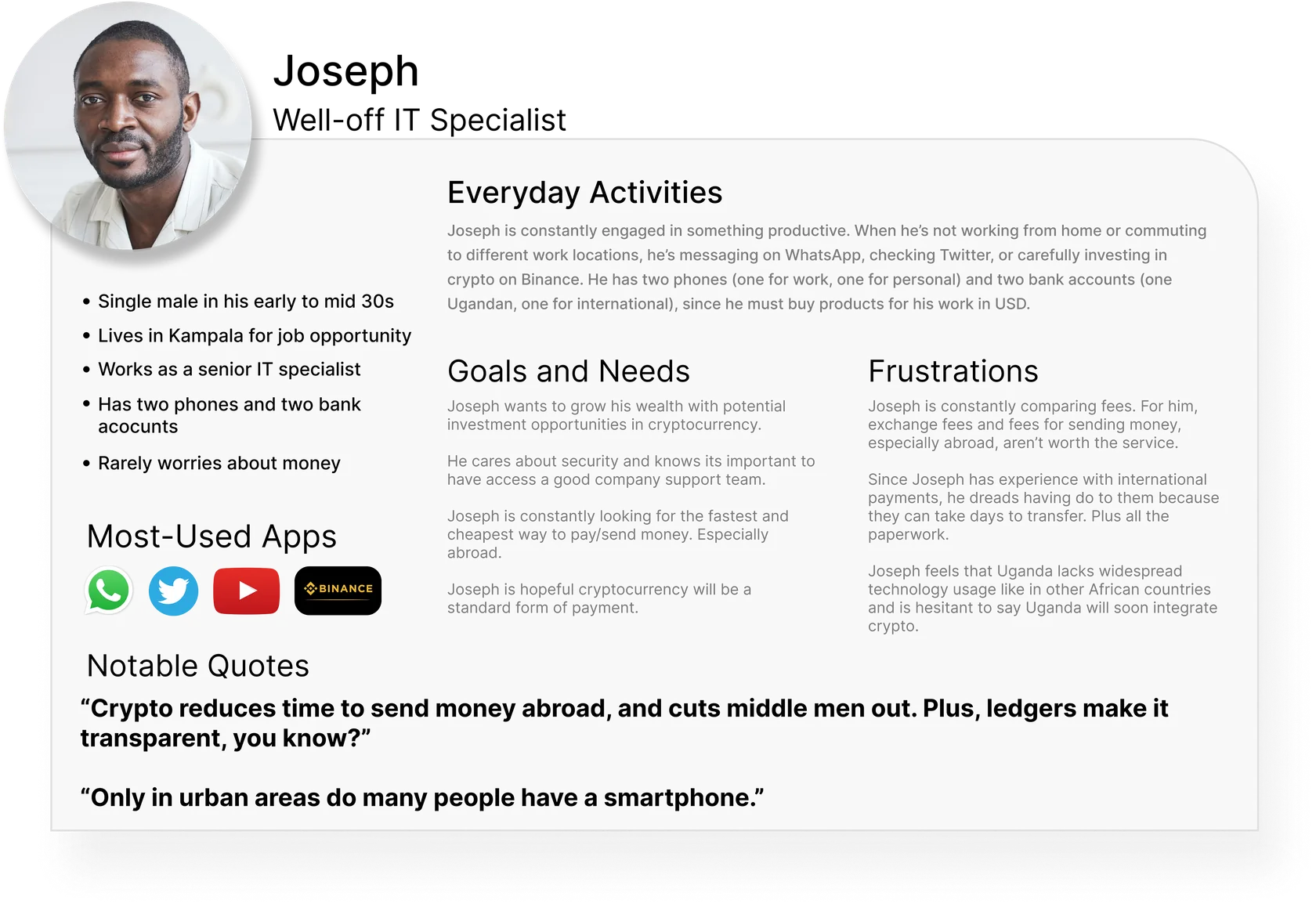
Testing showed self-custody felt risky.
Users wrote down and kept a 12-word recovery phrase. Lose it, lose your money.
The phrase is generated automatically and safely backed up, with no risk of permanent loss. Blockchain's low fees stay.
We had overestimated how comfortable people were holding their own keys. It also clashed with the business model, so the change helped both users and the company.
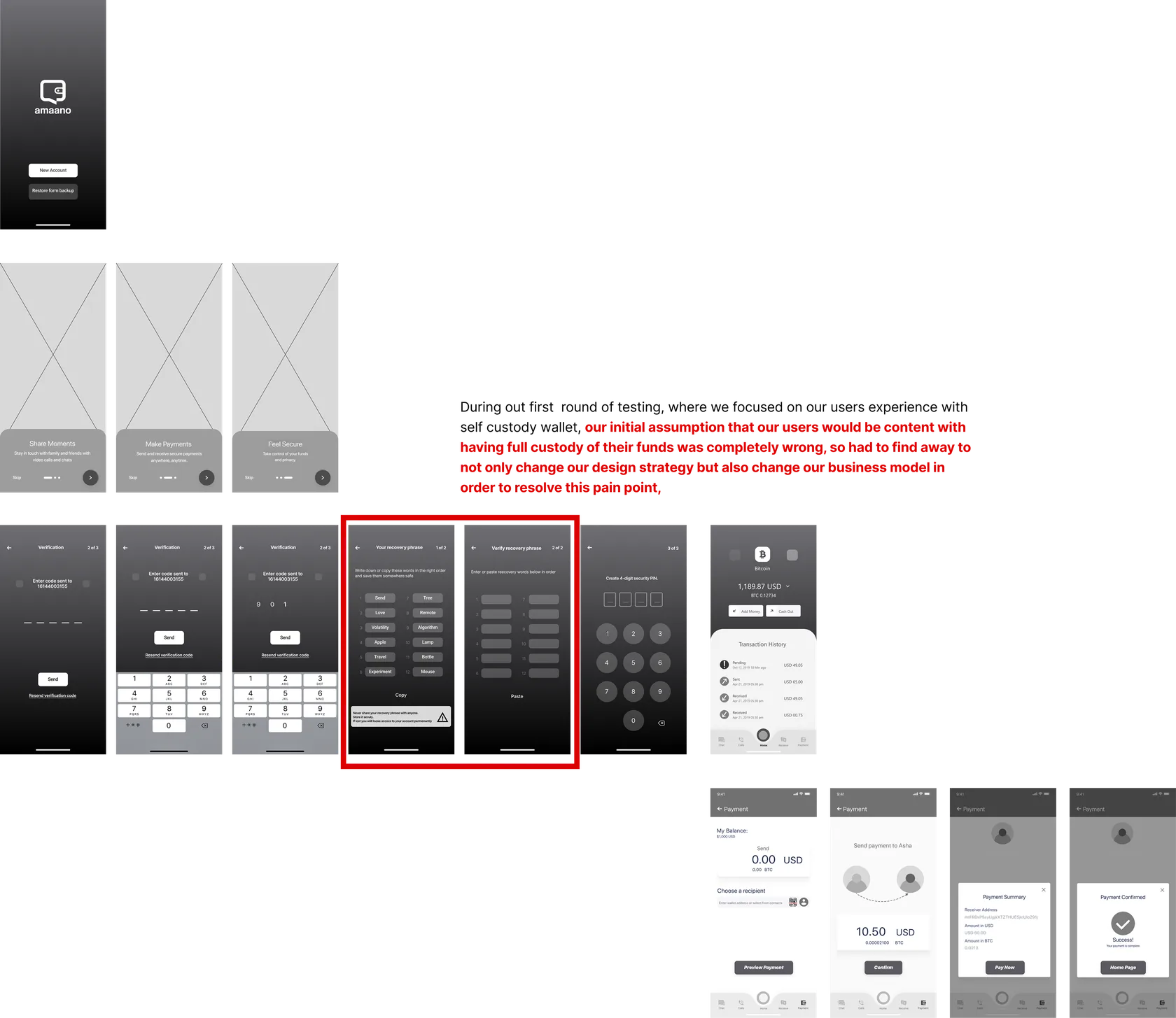
Designed for real conditions.
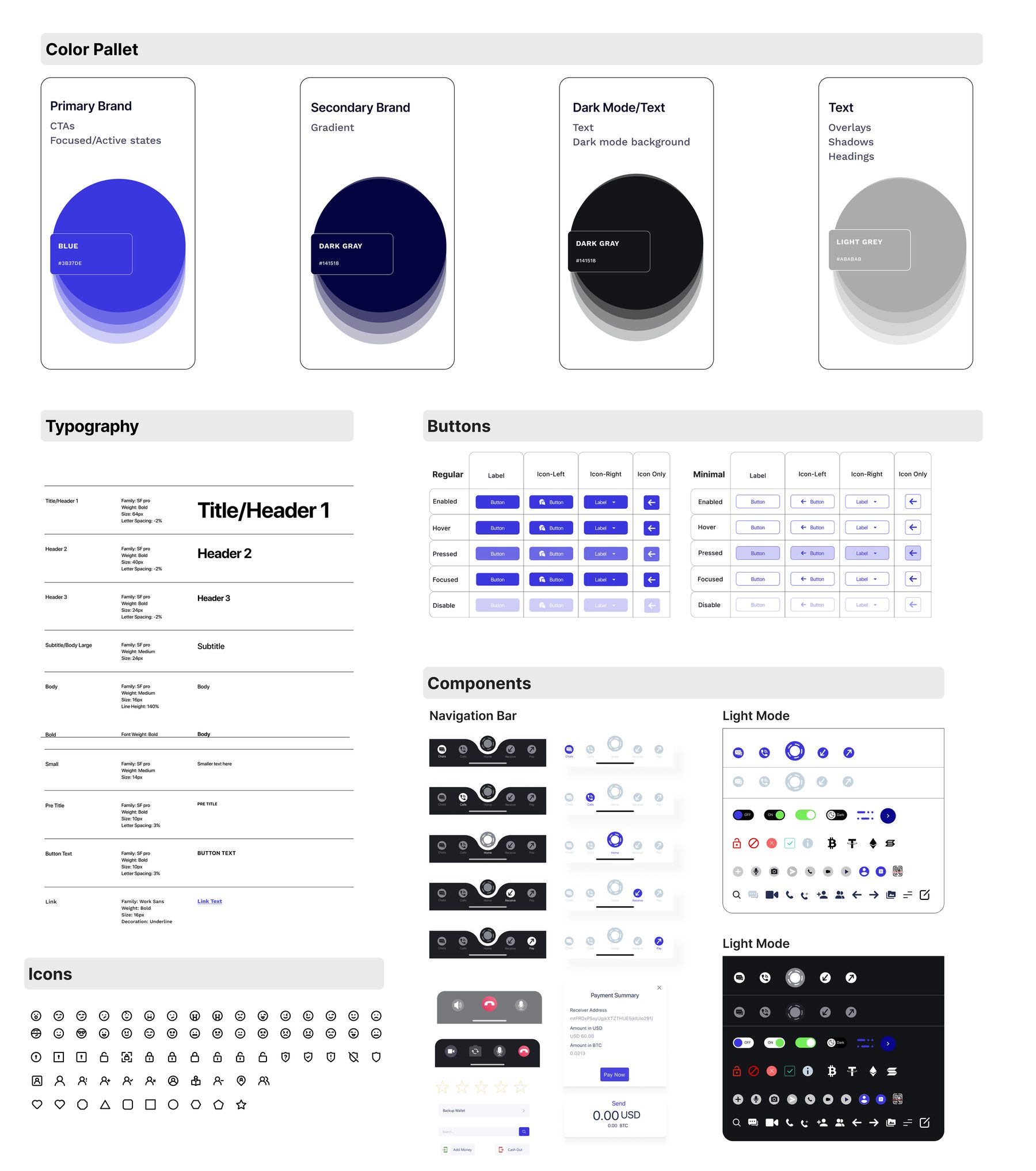
- Built a Figma design system for consistent, fast high-fidelity work
- Rapid tests on mid-fidelity screens, then iterated on key flows
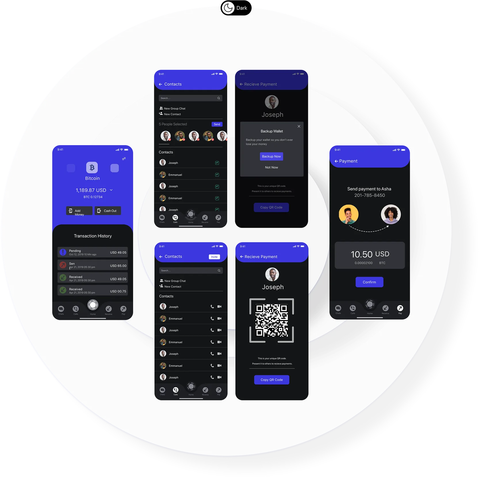
- Many users live with unreliable electricity and check their phones at night, so we added dark mode
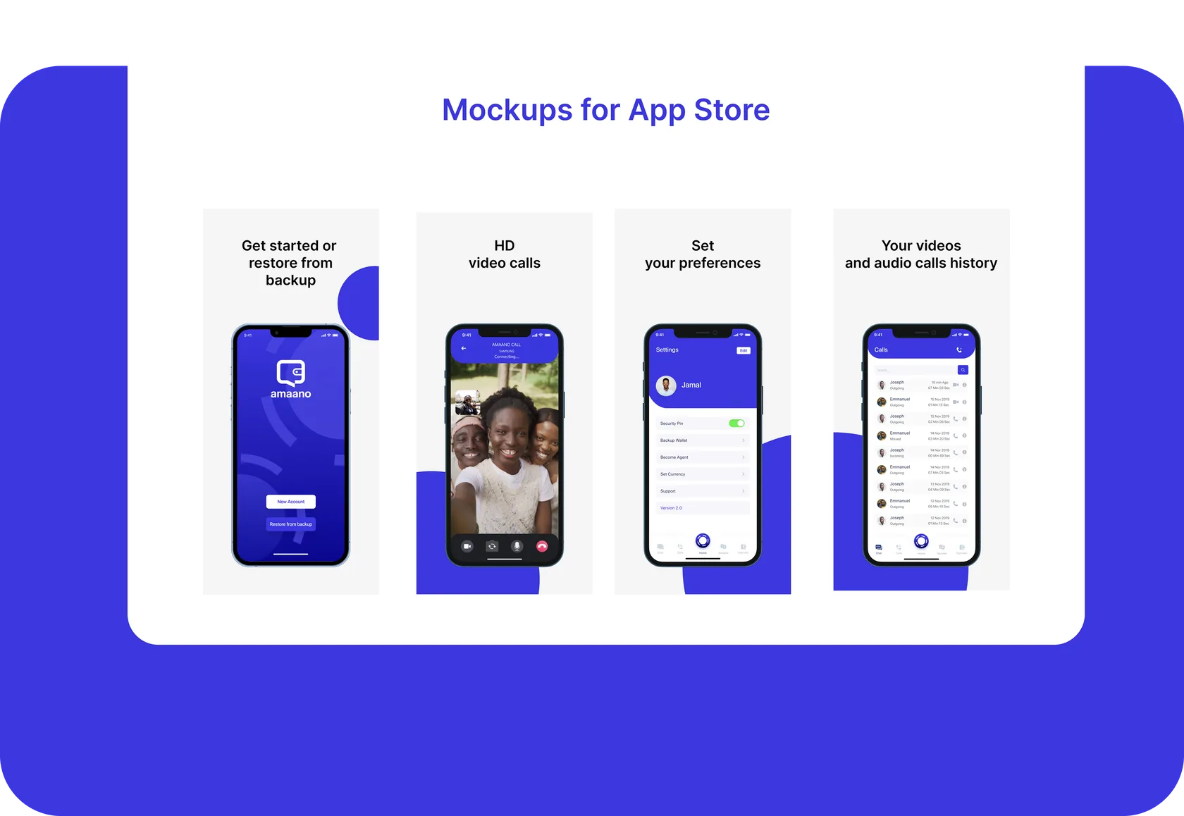
- The design system and marketing materials were used across Africa
- Designs checked against WCAG 2.1 accessibility standards
Faster, clearer, more confident.
Not yet tested in regions we could not reach, so that remains an open question.
Two lessons I still use.
- Keep the UI consistent during hi-fi tests. Varied styling made people comment on looks instead of usability.
- Bring engineers in early. Their constraints made the design better and faster.