Role: UI/UX Design/ Graphic Design / Branding
Platform: Responsive Website
Duration: 16 weeks
Industry: E-commerce
01/project overview
The Problem
With a booming middle class, travel is becoming more prevalent on the African continent, unfortunately, there is no product catered to them forcing them to either rely on local travel agencies with their limited capabilities or large international travel pages like Expedia which don't correctly reflect their needs making traveling among African countries difficult and expensive
Our Solution
Create a travel website focused on this new traveler class with features that are catered to their needs with the goal of making travel accessible and affordable for everyone.
02/what our users are thinking
Preliminary Research
With the emergence of a strong African middle class, there is an increasing demand for regional travel across the continent. The International Civil Aviation Organization expects Africans to fly 8.3% more miles in 2012, making the continent one of the fastest-growing markets for air travel.
Target user: The African Middle class
- Has a high interest in travel and discovering the world
- Financially stable, usually from age 25- 70
Talking to our Community
I conducted interviews to understand the likely pain points of users, their needs, and their behavior to avoid implicit bias or any bias for that matter.
Based on the interview,
11 Expressed interest in some kind of bundle or vacation package.
12 Are frustrated with scattered resources and information.
4 Say they still drive to local travel agencies to book their trips.
Key Insights
As a result, our key insight from talking and understanding our customers was that they wanted a platform that would provide a one-stop shop for all their travel needs in a reliable manner.
Our Persona
After our interviews, We used the insights gathered to develop a persona to summarize the insights gathered in our research.
Project goal
03/Brainstorm and iterate, iterate, Iterate...
Competitive Analysis
User Flows and Site Maps
After completing my research, I had a pretty good idea of what this product typically contains and how it's organized. With that knowledge and my earlier insights about our users, I developed user flows and site maps before starting the ideate on an individual screen.
Low fidelity wireframes
At first, we thought that having a landing page informing our users all they could do on our website was the best approach, but during our first usability testing they really didn't see the benefit of going through the landing page first
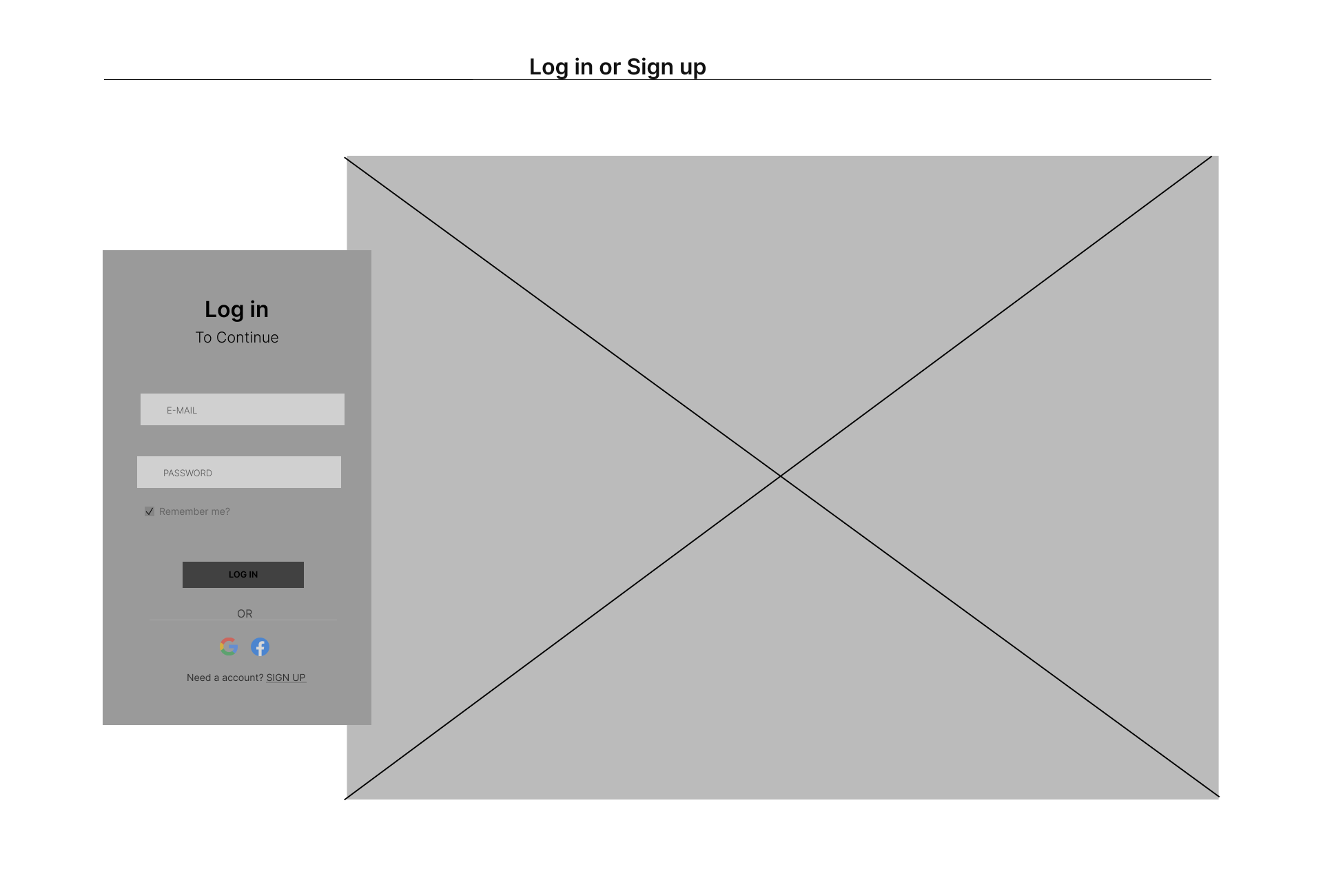
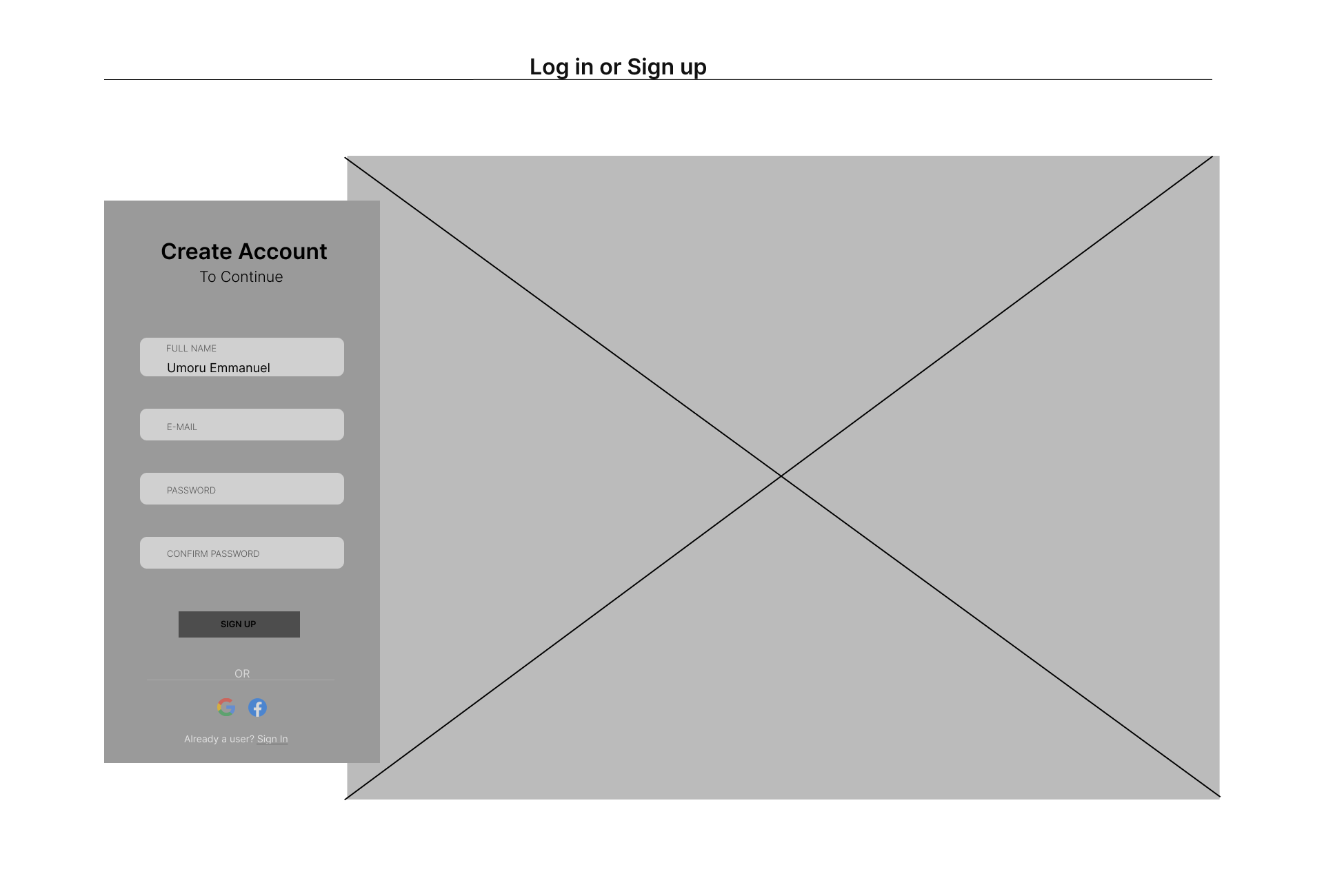
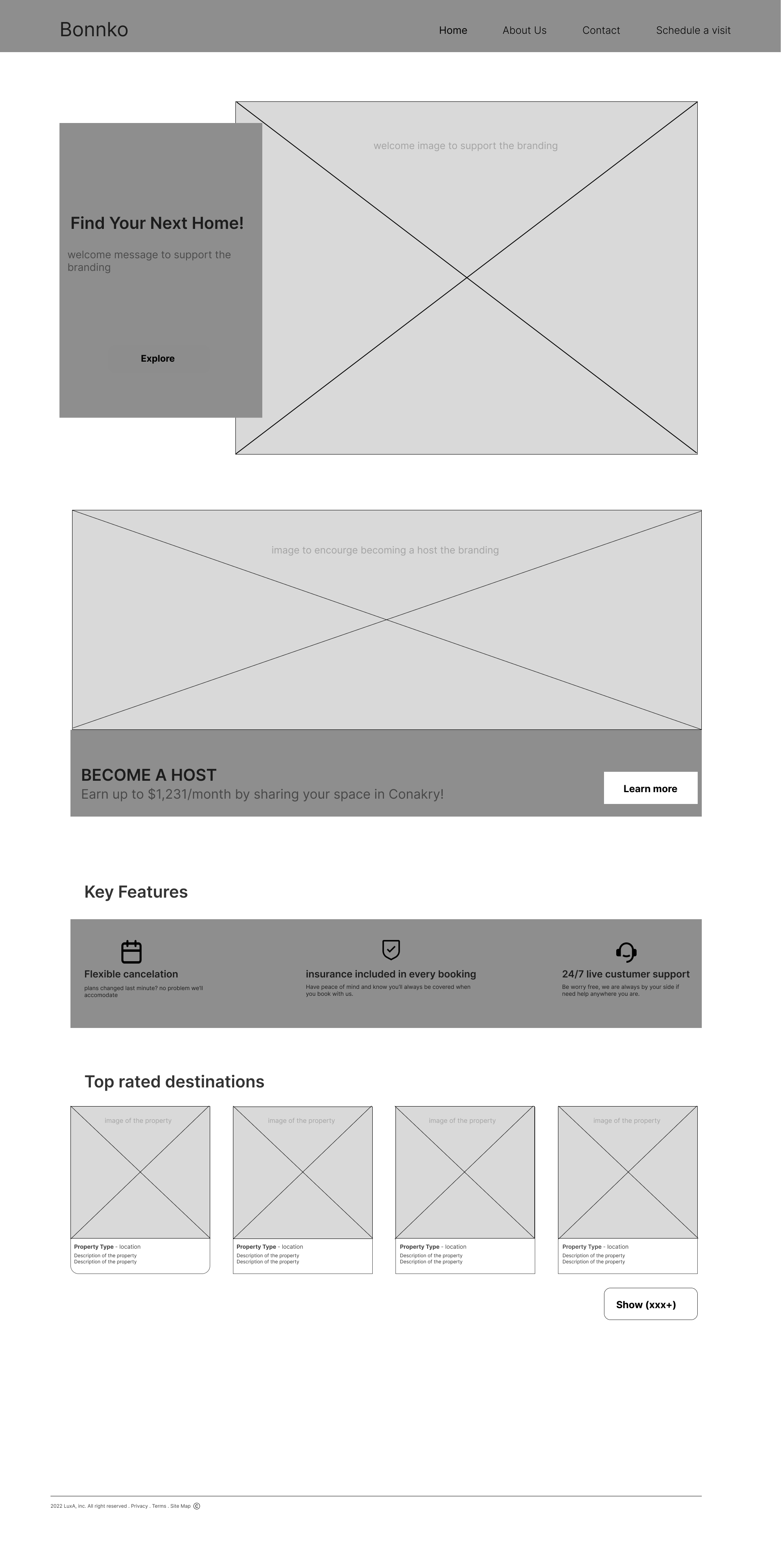
home page wireframe version 01
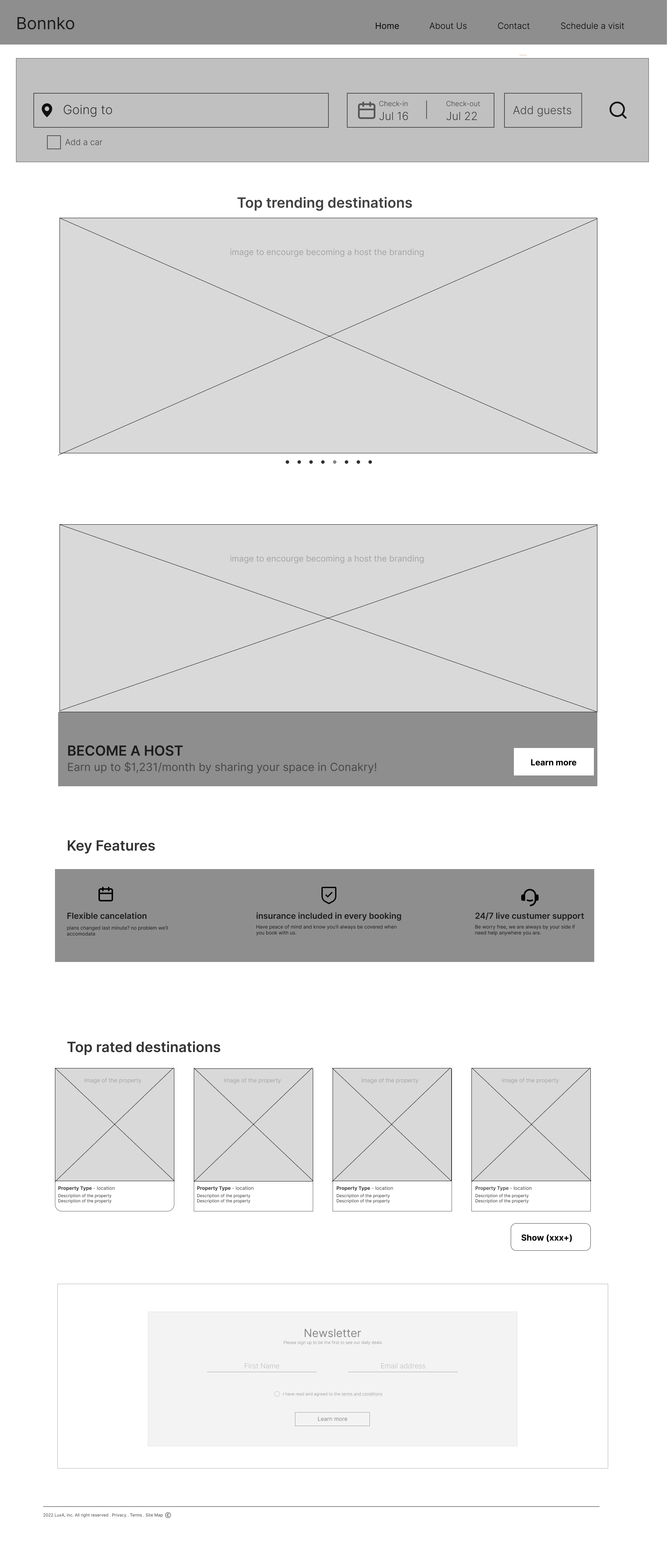
Home page wireframe version 02
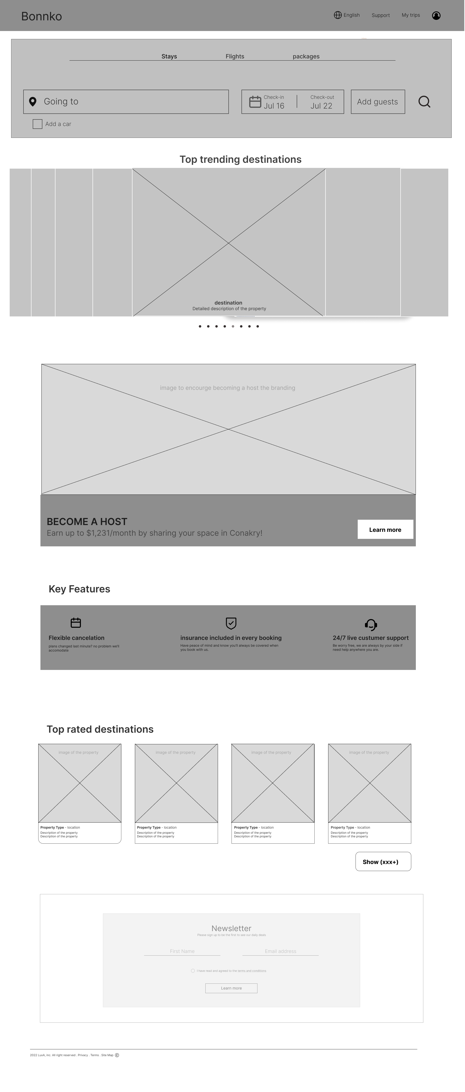
Home page wireframe version 03
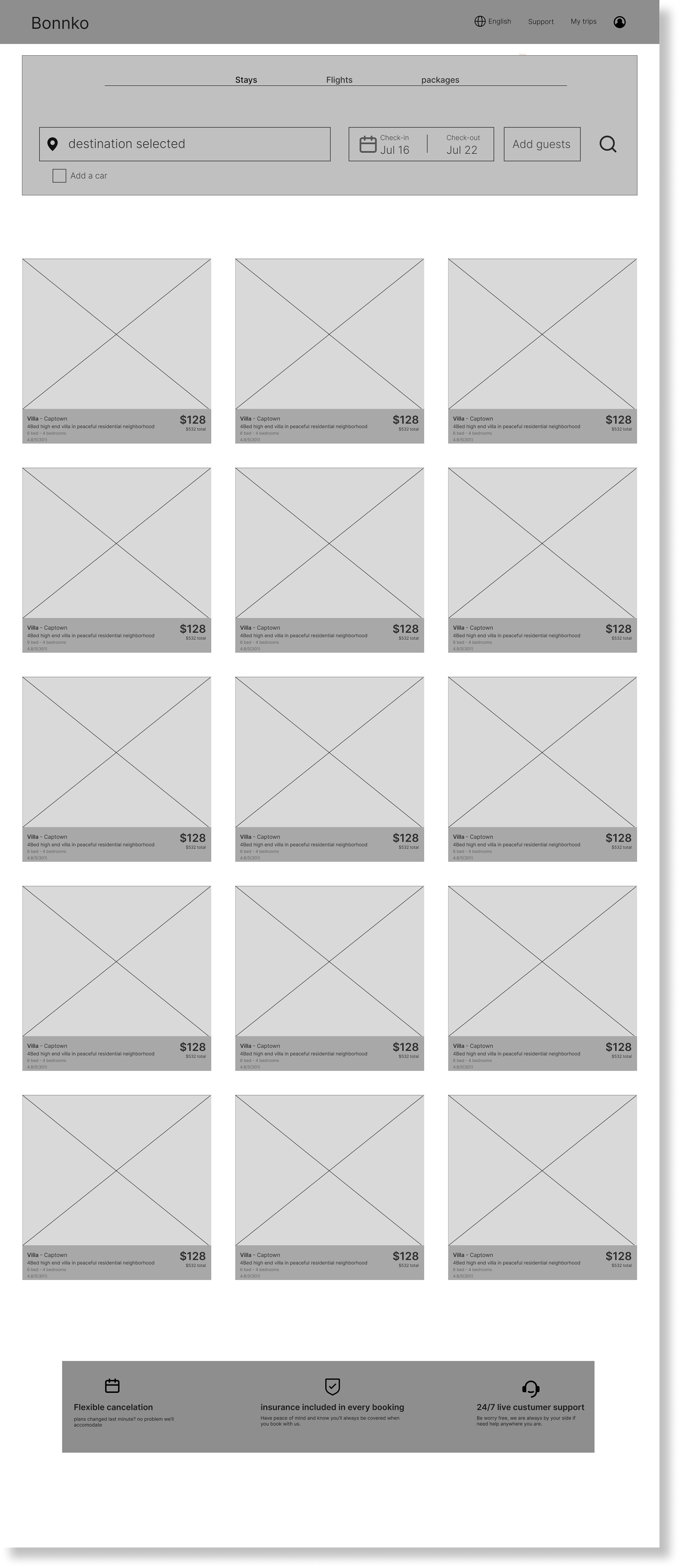
selected destination wireframe
04/Our hi-fi
Design system
Before developing a high-fidelity prototype, I first developed a design system to assure consistency in my design while contributing to a more efficient workflow. design systems are live documents that evolve as the project progresses but setting a strong foundation before moving into Hi-fi is key to establishing consistency and minimizing errors
although design systems are live documents, meant to be updated as the project continues, establishing one early on is important to create consistency and efficient workflow.
Hi Fidelity prototype
The biggest insight was that most of the African middle class is not used to traveling, thus creating a product with easily bookable features like bundles and trending destinations were options that our customers loved during our interviews with them. as a result, we designed the search bar to travels with you through the website, we also added a package option for those who want a hassle-free booking and the home page offers latest deals and vacation packages
05/We tested how easy our product was to use
Usability Testing
We tested 4 participants on booking a flight and using key features like bundles and filters on our hi-fi prototype.
- 100% of the participants were able to book a flight through the search bar
- 75% Were able to navigate the site with clarity
- 100% of the participants said the bundling feature made them a lot more likely they would book a flight
We wanted to keep the structure of the page as simple as possible, to reduce visual clutter. this was especially useful for our users because they were used to a lot of confusion when booking trips so we wanted to simplify this product as much as possible so we kept key features of the product like the search bar as their website companion so they can easily search something if an idea popped up.
With the idea of simplicity in mind, we translated the wireframes into these final designs through multiple iterations and tweaking until we came to a product our customers would love.
At first, we thought that having a landing page informing our users all they could do on our website was the best approach, but during our first usability testing they really didn't see the benefit of going through the landing page first
06/Our Mockups!
Key takeaways
I learned firsthand that being a strong advocate for the user is primordial in achieving a product people loved, so I wished I advocated for my research at earlier stages of the design development, especially during the low-fidelity prototype phase so that we can focus more on the UX and before proceeding high fidelity prototypes.
Thank you for your time!
